Chocolate that makes me see red!
by Sukey Miller

Some big companies really miss the point of mobile.
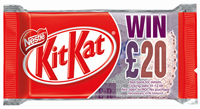
 I often travel to London and one of the simple pleasures on the return train journey is a cup of coffee, a Kit Kat and a seat. (I’m easy to please 🙂 So I was doubly excited to see the “Win Twenty Quid” offer on the bright red wrapper. You just had to get your mobile out and send a text message with a secret code from the inside of the wrapper. I enjoyed my Kit Kat – it was a new dark chocolate version – and then with slightly chocolatey fingers typed the the gobbledygook 12 character code in an SMS message on my mobile and sent it to their shortcode. In a flash I got back the message “Sorry, you haven’t won this time. Keep trying…” Oh well better luck next time.
There was also a link on my mobile screen with “T&Cs at www.wintwentyquid.co.uk” so I thought at least I’ll be able to get a freebie wallpaper or find out some useless Kit Kat facts, like it was first produced in September 1935 in York.
But no – to my amazement and horror, the URL which had been sent to my mobile phone, was for the desktop PC website. My new Nokia N95 coped fairly well downloading and rendering the 100K of useless non mobile page, but I’m sure for many customers, all it will do is take a while, cost them in data charges and hang their browser.
How in this day and age can a company with the marketing might of Nestle get it so wrong? I could have had a great mobile user experience and interacted positively with their brand. But I was left bemused and wondering about the 10 million or so other people who click the link and get left with a bad taste.
Perhaps I should just stick with eating the chocolate.
Subscribe to our newsletter
Get the latest subscription bundling news and insights delivered straight to your inbox.


