Living with a super model – the HTC Touch HD
by Sukey Miller

The first 5 days with a HTC Touch HD
I had my first Windows Mobile phone when I worked at Microsoft – an original Orange SPV that I hated because of its poor UI and short battery life. But here I find myself with another Windows Mobile handset, this time the new HTC Touch HD. But does this new super model live up to it’s “smartphone” name or is it the same old dumbphone with a new dress as it totters its way down the catwalk?
I had been looking at the latest range of smartphones for some time before opting for the new HTC. I loved the format of the Apple iPhone, its lovely big screen, great UI and growing number of cool apps to download. But ultimately I did not want to be restricted by the closed Apple system.
I looked at a G1, but I’m not even sure I like the look of the first Google phone – it ain’t no iPhone. The software has a lot of promise, especially if you are a developer, but for me it looked like an early release that needed a bit more polish. The final runner up was the Blackberry Storm – it looks and feels great, a real threat to the iPhone. It has a decent UI and an ever so clever (but simple) clickable screen.
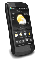
After much deliberation I decided on the Touch HD for a couple of clear reasons – that 3.8 inch 480×800 screen is to die for and it all fits into a package the same size as an iPhone.
On taking delivery, the first thing of note is the packaging. A nice solid box with magnetic lid inside a simple slip case – it feels like good quality. Open the lid and the phone looks a million dollars. Getting up and running was simple, pop the back cover off and insert a SIM card and the included 8GB Micro SD card (you also get a simple soft case which most sites fail to list).
I popped it on charge, although there is enough juice to start playing immediately. Once through a simple one-time screen setup you are presented with the TouchFLO 3D interface and on this handset this UI has found its place – flipping between tabs is simple fast. Getting stocks and contacts set up was easy, although I would like to have an RSS tab that acts as a primary news portal. As it is I keep scrolling to the “programs” tab to start RSS Hub.
Once past the glossy TouchFLO 3D, it comes down to the day to day use – and it’s pretty good. Speed is decent, sure it could be faster but I guess it’s a trade off between power and battery life. I know how friends complain about their iPhone needing a daily charge. I found that I could easily go 2 days with normal use, although normal use has involved lots of web browsing, RSS feed reading and showing people what the phone was.
There is a good set of decent apps installed – like Google Maps, Microsoft Pocket Office and RSS Hub. I did install Yahoo Go and although it worked, it did not use the full screen and occasionally left text behind. Microsoft Live Search worked a bit better but wasn’t as slick as the Google offering. The new touch keyboard works well in the same way as the iPhone keyboard. I also played with the handwriting recognition and it works great on this big screen – I can quickly and easily take notes using the pocket edition of OneNote. It’s also very easy to insert screen captures to go with the text using the pretty decent 5 megapixel camera – ideal for meetings and whiteboards.
And lastly we have the browser – the latest from Opera. This really excells on the big, high-res screen. Double clicking parts of the screen zooms in and causes the text in the column to re-format to fit the screen width, making it really easy to read.
So what about problems? What did I hate? So far not much… The sensitivity on the touch screen is not as good as the iPhone, not to mention the lack of multi-touch, but you get used to it. The browser is still not perfect, it needs to have Flash integrated to view many websites and although that is possible with SkyFire, their browser did not run on the Touch HD. Not having a flash for the camera is not ideal, but since the flash on most handsets are rubbish, it’s not too much of a loss. I do miss having TomTom Navigator, version 6 does not work and Google Maps is not quite the same – so I’m waiting for more news on TomTom version 7.
So after a long weekend I must admit that although my new super model has a few blemishes it still lives up to expectation, and as for that screen – did I say how great it was?
Subscribe to our newsletter
Get the latest subscription bundling news and insights delivered straight to your inbox.


